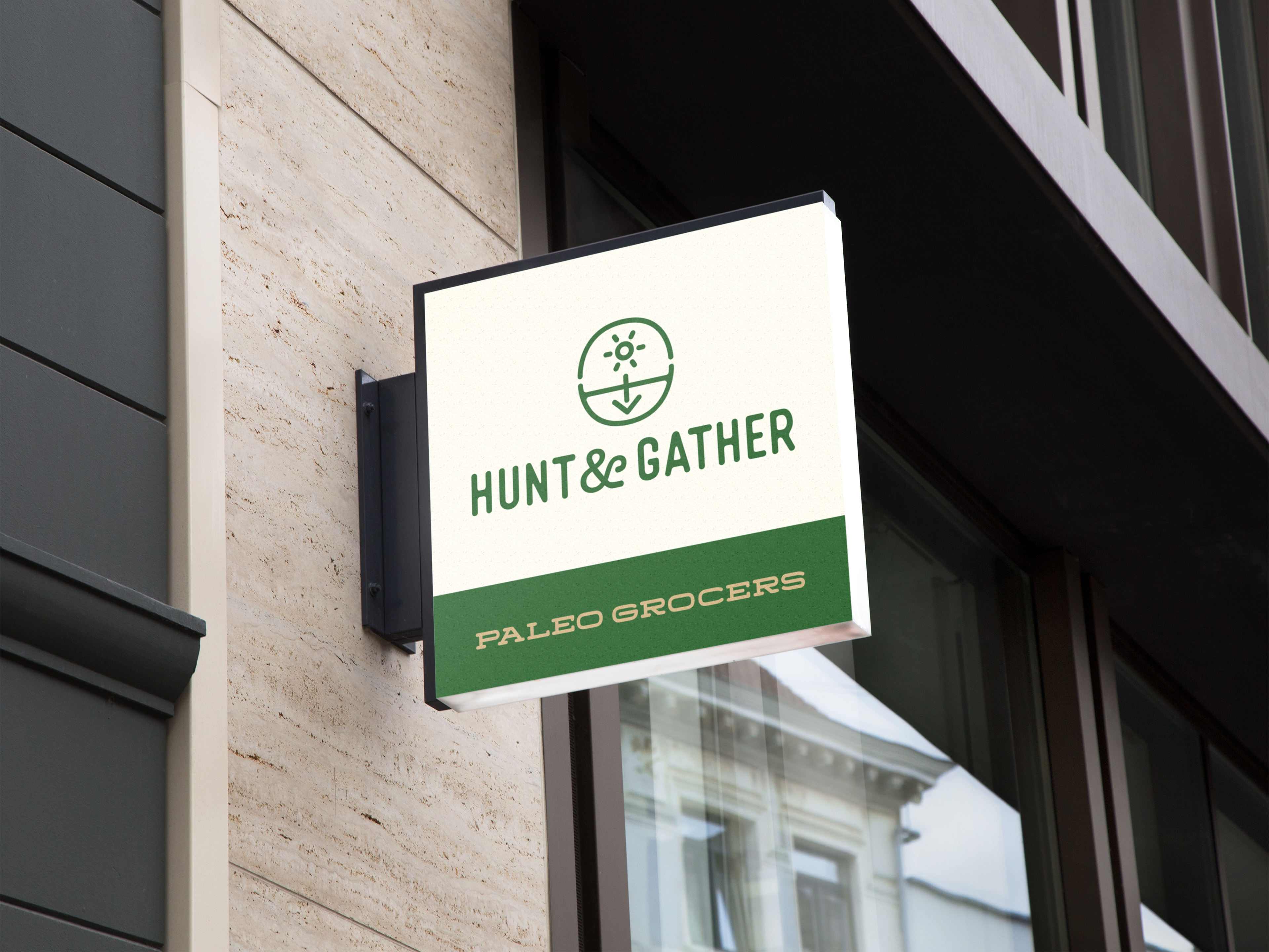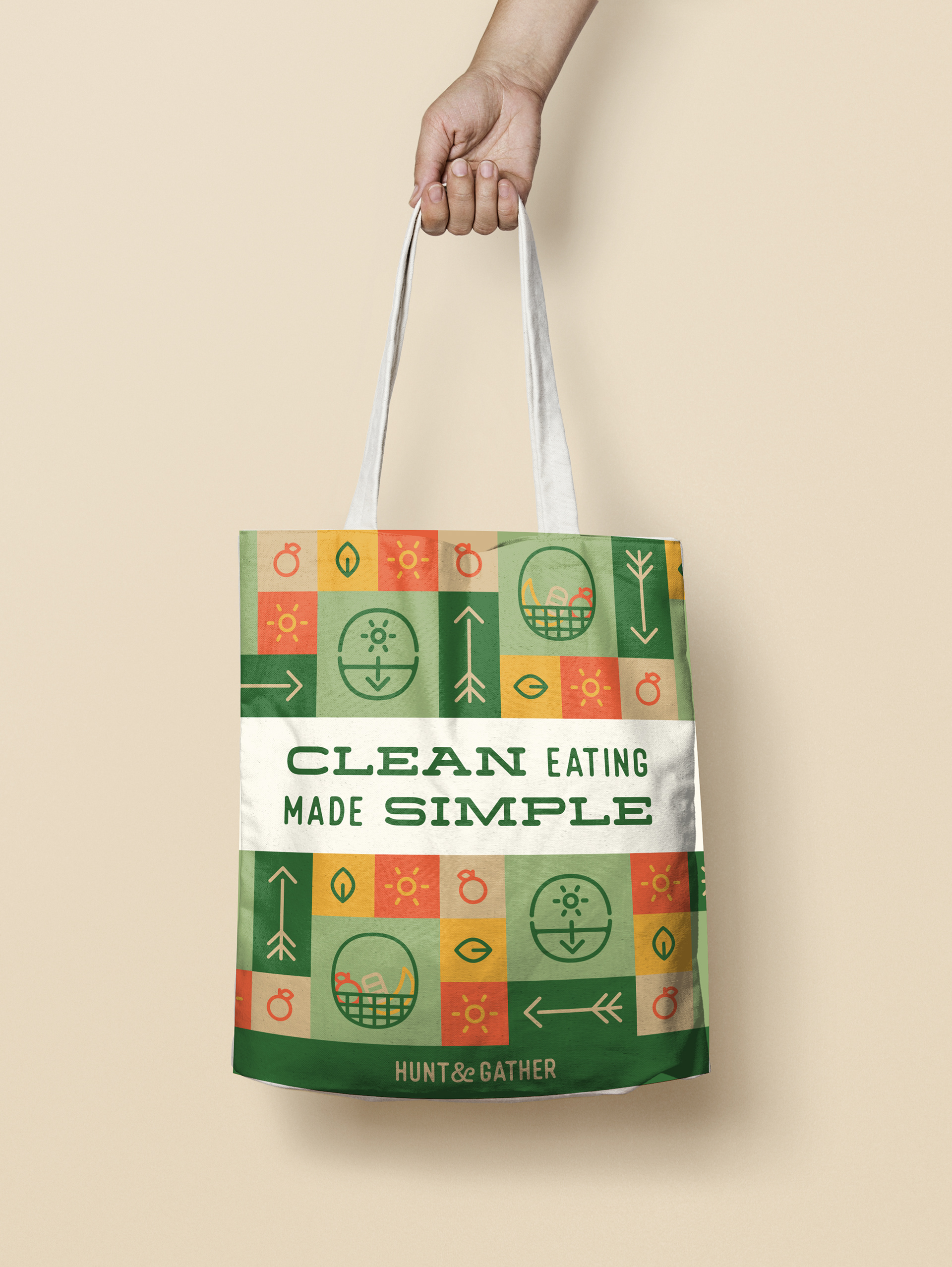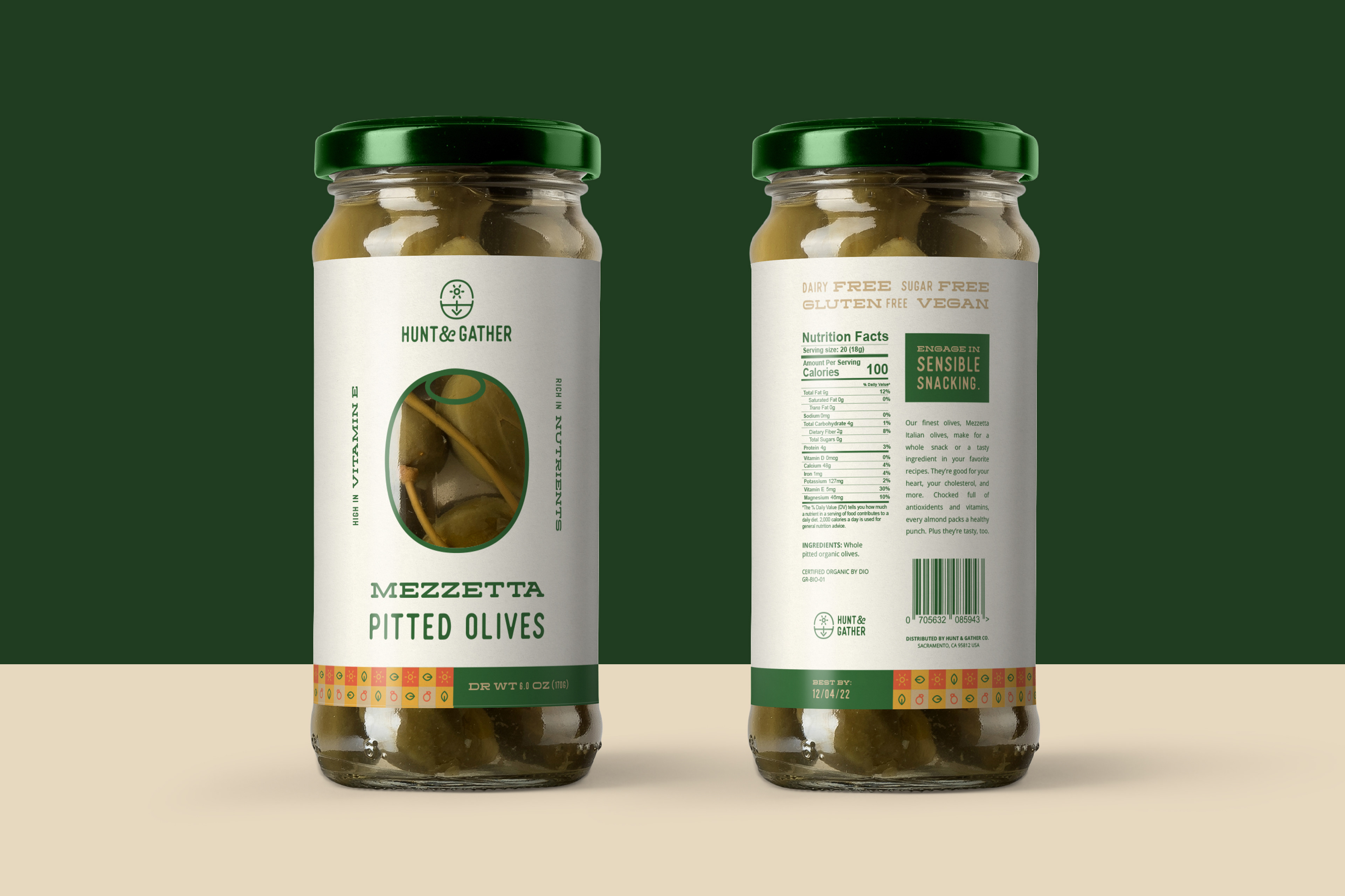

Hunt & Gather is a grocery store that prioritizes paleo and organic foods. The name comes from the term “hunter and gatherer diet,” another term for a paleo diet, referring to the societies in early human history who obtained the majority of their food through foraging. The target audience is adults with an income between $60,000 - $150,00 who are interested in heath and wellness, have an active lifestyle, and are looking for clean eating solutions. Tone words include fresh, healthy, crisp, helpful, and down-to-earth.
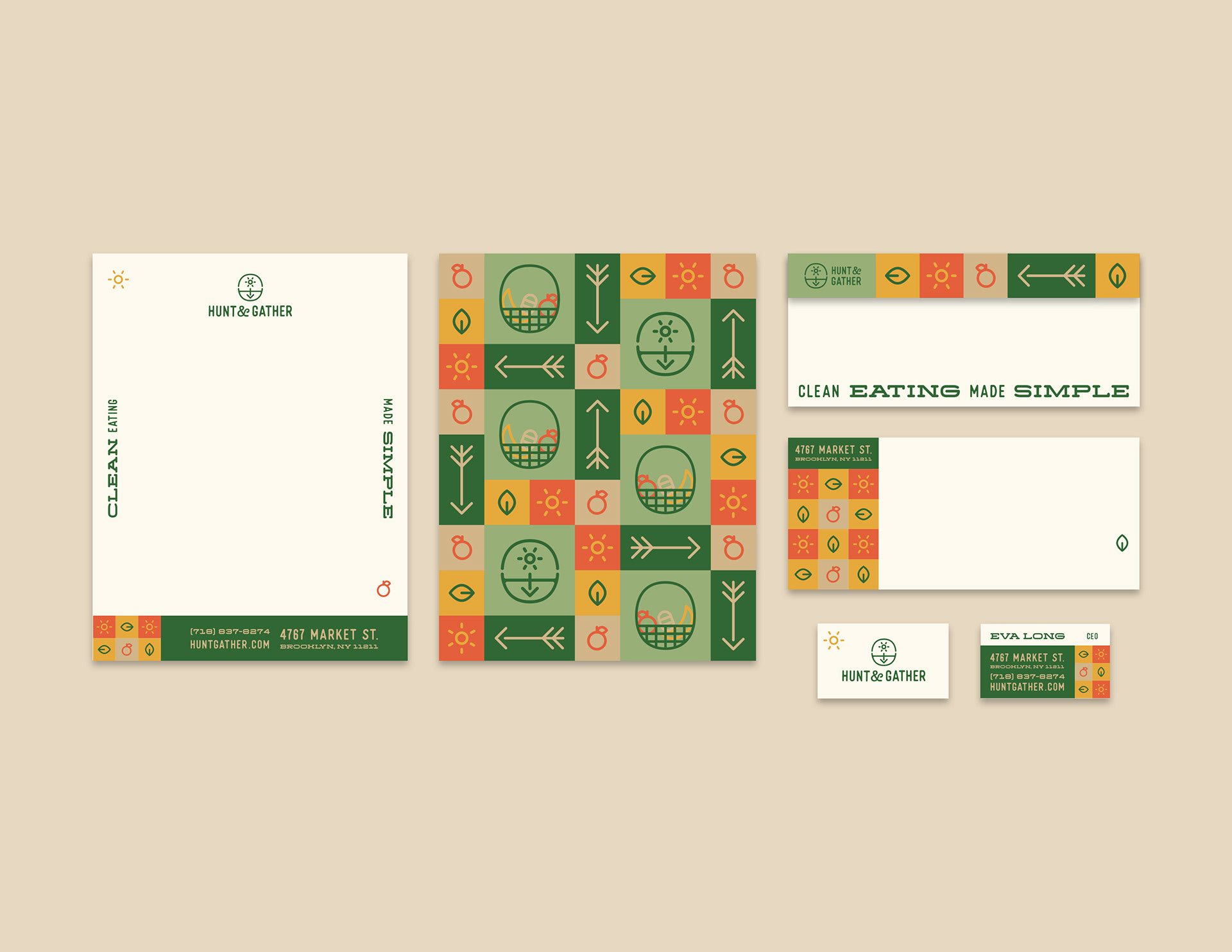
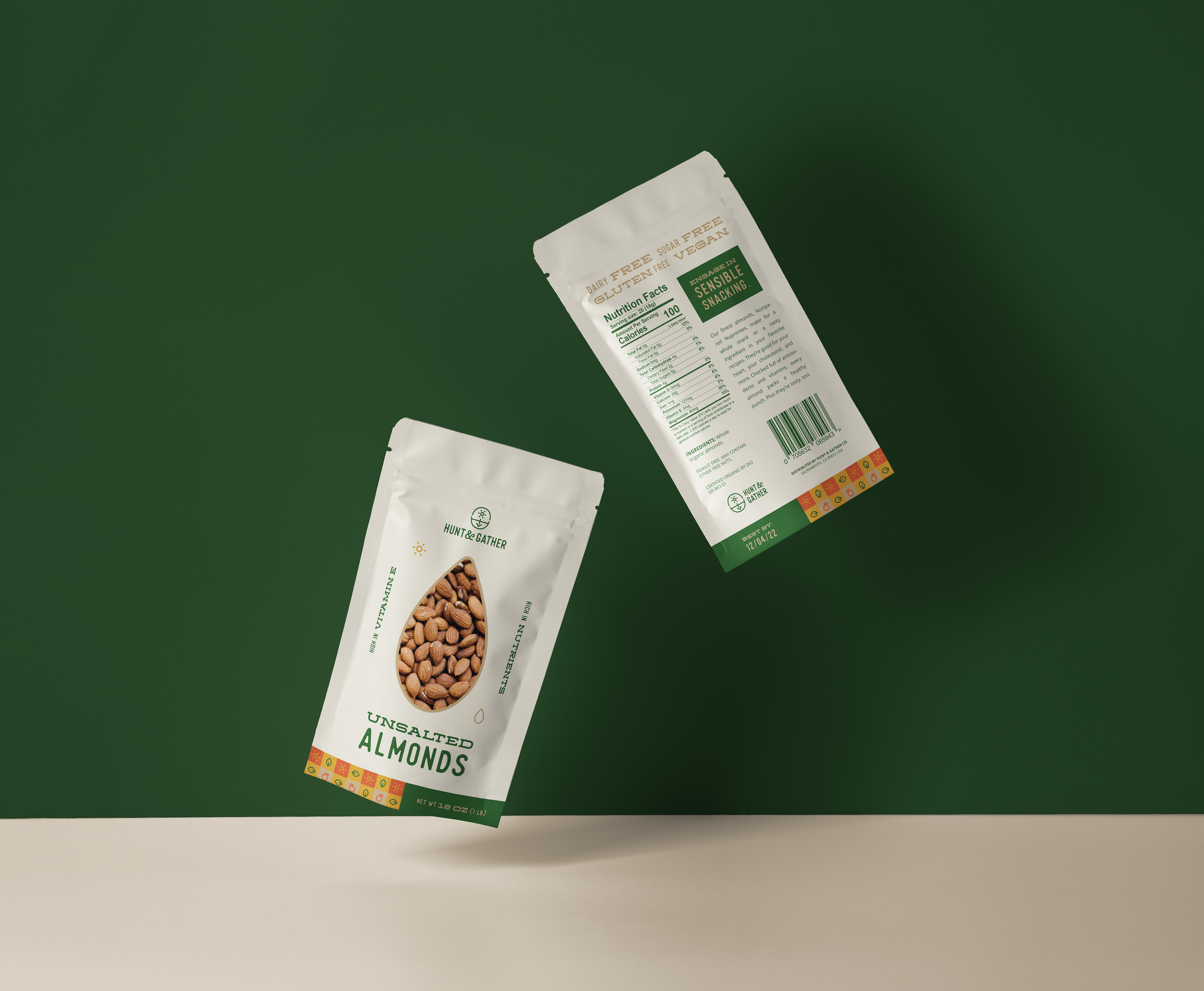
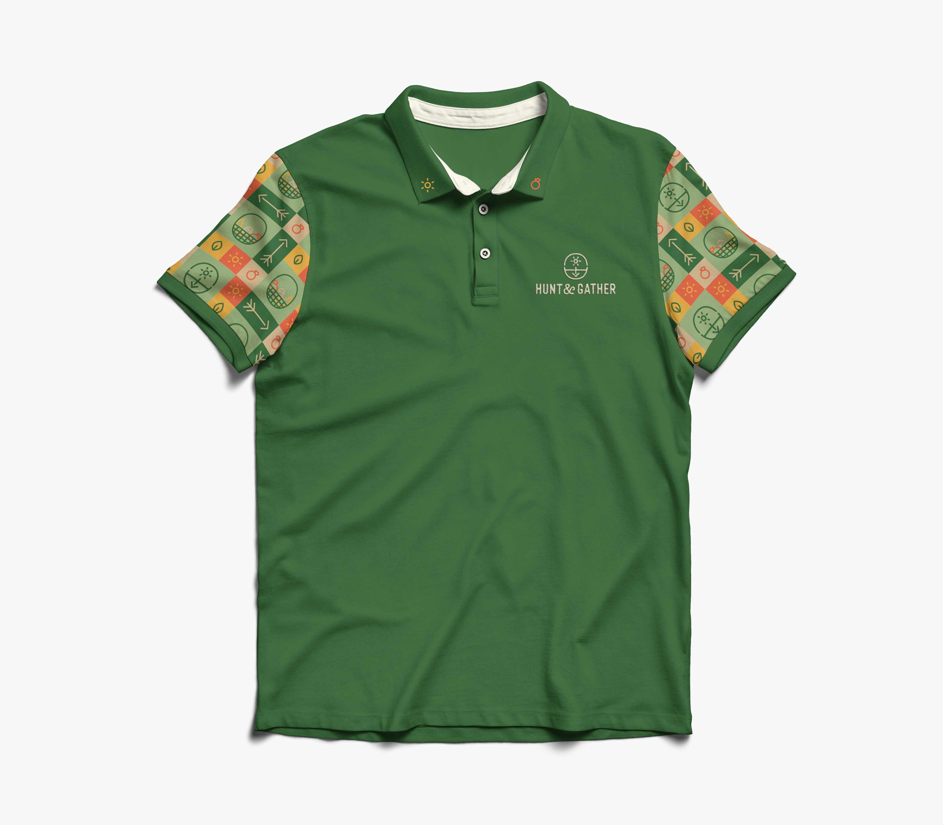
The logo blends together a bow and arrow, a basket, and a scene of a plant growing—all essential aspects of the paleo diet. I went with an earthy, natural color palette, which I used to the fullest in the bright, energetic pattern. The pattern uses symbols of aspects of the paleo diet, such as baskets for gathering and arrows for hunting. I kept the layouts clean, and made them engaging through use of the pattern and dynamic typography pairing. On the packaging, I added windows to show the interior product and symbolize transparency in the quality and purity of ingredients.
Silver Award / UDA International Design Competition